|
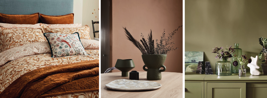
Here at The Woven Edge, our dedicated design team look to the latest interior trend resources to bring the biggest colour looks for this year. 1. Inspired Earth.A palette of grounded tone cushions your surroundings with warmth to help create that cozy and intimate interior. Plaster inspired pinks, deep burnt orange and brown tones as well as dark golden greens, gives that much needed nod to nature. Layering such tonal shades can give a minimal look with added depth without having to use the standard go to backdrop of brilliant white. Imagery from left to right...William Morris Sunflower Bedding, Dulux-Restore, Homes & Garden-Neptune.
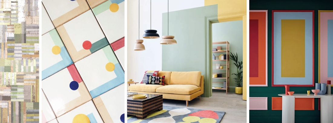
2. Colour Blocking.A simple but sophisticated way to introduce a multitude of colour and easily achieved by using a variety of pattern. Integrate blocked shapes, curved line, spliced stripes and abstract geometrics within your interior scheme as a starting point and then zone areas to plan your approach to pin point what you’d like to highlight. You can paint sections of the walls, the ceiling and even the furniture, there’s just no constraints to this look. Imagery from left to right...Real Homes, Portuguese patterned Tile by Elina Passina.com, Habitat roomset, Designers Guild 'Achara' Wallpaper.
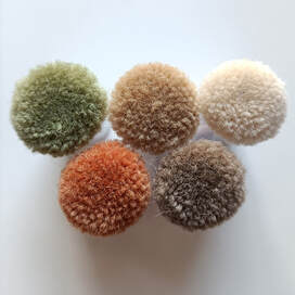
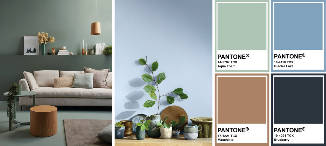
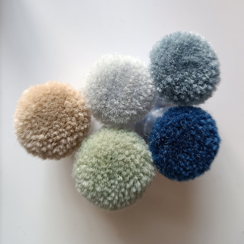
3. New Neutrals.No longer are we constrained to decorating with a standard backdrop of beige, greige and all the safe shades inbetween. Now we see modest tones of green, blue and terracotta take centre stage as a new alternative to what we normally know as neutral. The latest looks and big brands such as Dulux back this, with the release of their colour of the year 2022, ‘Bright Skies Blue’. Green has also been a highlighted staple hit for the past few years now and continues as a strong starting point to a neutral and nature inspired colour palette. Imagery from left to right...Resene - ‘Yucca’, Dulux - ‘Bright Skies’, Pantone Chips.
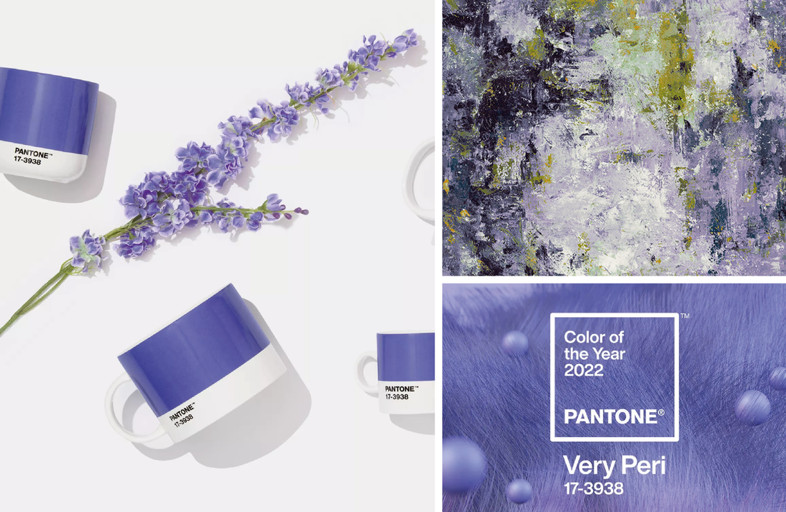
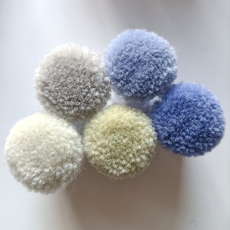
4. Very Peri.Pantone have released their color of the year for 2022, ‘Very Peri’ and has been described as a color whose courageous presence encourages personal inventiveness and creativity. ‘With the stability of blue being the base of it’s tone, it also captures a redness of violet’. Quoted from Leatrice Eiseman, Executive Director of the Pantone Colour Institute. For broader palettes look to shades of yellow and green for a complementary contrast. This look really will put a spring in your step. Imagery from left to right...Pantones colour of the year 2022 ‘Very Peri’, Arley House Oxidize - Purple Moss Fabric
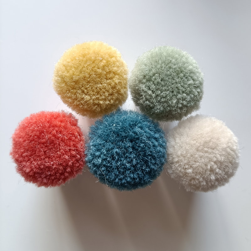
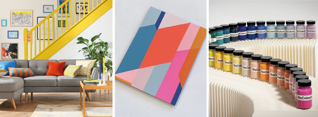
5. Bold and Bright.With more time spent at home, our interior surroundings are as important as ever to evoke good mental wellbeing and mood. In the well said words of Sophie Robinson, ‘Dull and drab is no longer acceptable for those wanting to live confidently, creatively and escape the prison of the beige-box-home. People in their droves are recognising that their home is the foundation of a life of creativity, happiness, inspiration and joy.’ Integrating bright shades of sunshine and playful patterns can really uplift a room. Accentuate the intensity of tone by working on to ivory backgrounds and also, look to how opposites colours attract. Don’t be afraid to mix, match and maximise. Imagery from left to right...Sofa and Stairway from Furniture Choice, Artwork by Frea Buckler, Paints by Yes Colours.
0 Comments
|
Archives
January 2024
Categories
All
|
|
Contact The Woven Edge Head Office
Digital House Stourport Road Kidderminster Worcestershire DY11 7QH Tel :01562 215115 |
|

 RSS Feed
