|
Finally we have seen the sun for the first time this year and colour has burst into action and opened our eyes to key trends. Pantone has demonstrated key pops of colour reflecting recent exhibition and trend direction from Heimtex and London Design Week amongst various other shows so far in 2018. Embracing bright colour will be the standout trend for Spring 2018 and the Pantone palette features in our blog Top Tips for a Luxurious Living Room. 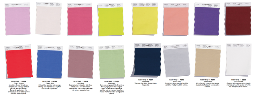 London Design Week Highlights. The trends brought to us by the showrooms of Chelsea Harbour this spring, bring us sophisticated and intricate design with a wealth of confidence in bright colour and bold print. The depth and attention to detail stands up to further scrutiny rewarding your eyes upon their second look. Neutrals are brought to us in natural, unbleached materials such as sea grass, wool, slubbed silks and cottons with a celebratory splash of champagne to add some class. Metallic tones of silver and stone greys pair well with mineral and elemental inspired palettes of green malakite and peridot, showing the first shoots of spring greens. Other dominant accents brought us shades of yellow including butter milk, mustard and ochre. Indigo, teal and peacock blues will be big and pair up well with a warmth brought by coral through to rouge and burnt orange. With sunshine hopes for spring and summer come playful but subtle ice cream tones of raspberries, mint, vanilla and pistachio as shown below in our colour stories London Craft Week returns to the capital for its fourth edition and tickets for the special event are available here http://dcch.co.uk/London-Craft-Week-2018. 'Reflecting a rising global appreciation of exceptional craftsmanship, it attracts a discerning audience united in their admiration of beauty, substance and authenticity'... if the hand crafted look is for you check out how our rugs are made https://www.thewovenedge.com/rug-making-process.html. Watercolour and painterly feels are still apparent, easy on the eye and fresh with texture flowing on all levels. Marbled effects, cloudy treatments, washed out bleeds and ikat influences extend the trend surrounding indigo dyed products and handmade techniques. These handmade elements mixed with recycled goods really highlight current world issues and just shows how much influence on interior trends this can create.
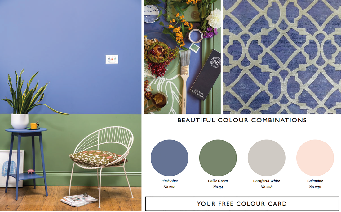
Spring Has Sprung Combinations of green tones and pastel shades of lilac inspired lavender and blue are a combination born to be together. They bring meadow inspired interiors and accentuate the need for foliage inside our homes. Farrow and Ball have created a refreshing look using their Pitch Blue, no.222 and Calke Green, No.34 giving us a real countryside inspired decorative scheme. http://www.farrow-ball.com 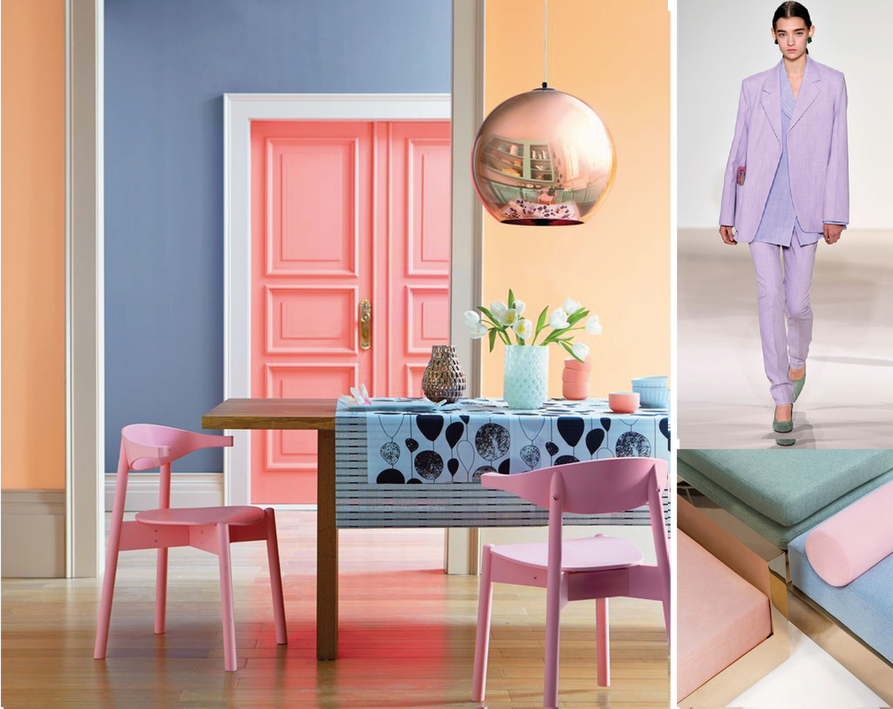 An Ice Cream Cone full of Colour Choose your flavour and sprinkle a joy of pastel shades over the top to mix and match shades of coral, pale blue, lilac grey and peach. The power of pastel is strong and injects lightness and a calming sense into a room. We have seen this flood not only into the interiors market but the catwalk too, really bringing fashion to floor. Use multiple shades combined with simple abstract forms of floral and fauna to add some contrast. https://www.celine.com/en-gb/home/ 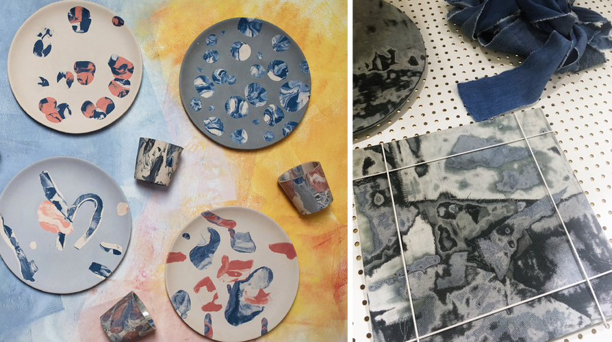 The Perfect Imperfect Having a focus on the revival of handcrafted products, 2018 has seen an influx of the changing of attitudes towards the effects we have on the planet and from this we have a new found acceptance for perfect imperfection and the recycling and reuse of materials such as plastic and rubber. Deriving from Japanese cultures of wabi sabi its all about bringing nature back home and being content with whats we have. Handmade crafts such as shibori and woven products are brought back to life within this trend. 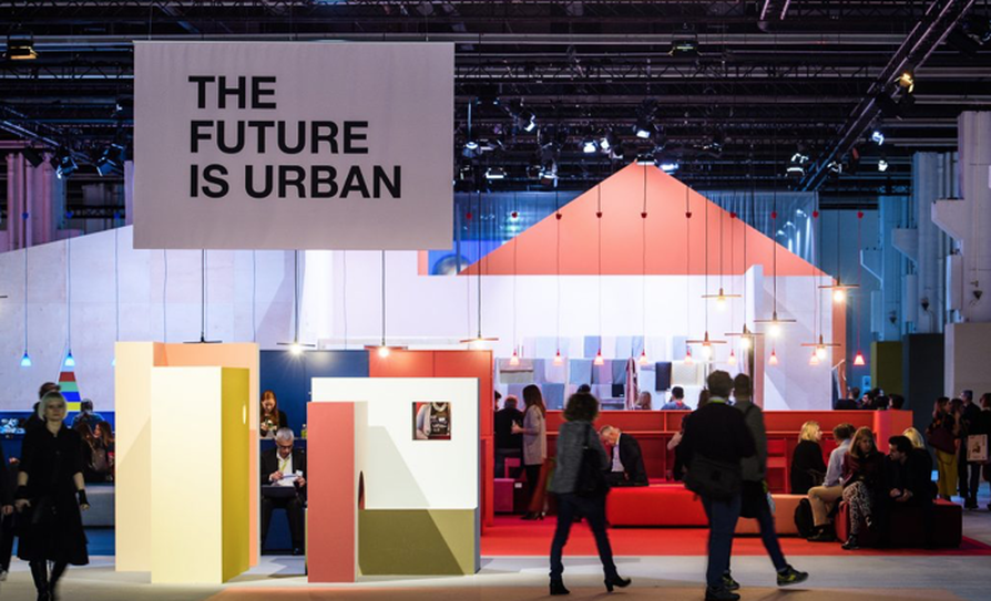 Heimtextil 2018 incorporated this movement as one of their future trends. It is the art of finding beauty in the something that is incomplete and not conforming to what is believed to be pure. 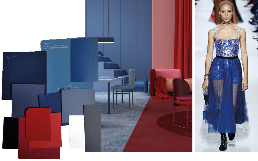 The Power of Pigment. Red and Blue Graduations of blue and red use as tone on tone colour palettes are big news. Design is kept simple with layers of contrasting scales of light and dark gradations of colour.
Cherry Tomato and Palace Blue from Pantones collection of Spring Summer 2018 colours show us the brightest sides of these bold hues. Red is seen to be the relaxing influence coming across as confident but soft, whilst Blues encourage energy being uplifting and fresh. Dior seen on the catwalk, combines multiple trends of translucent layers with a reflective edge of molecular design in a rich and appropriately royal blue colouring.
0 Comments
Your comment will be posted after it is approved.
Leave a Reply. |
Archives
January 2024
Categories
All
|
|
Contact The Woven Edge Head Office
Digital House Stourport Road Kidderminster Worcestershire DY11 7QH Tel :01562 215115 |
|

 RSS Feed
